The delirium of the fountains

-
CAT -
CAST
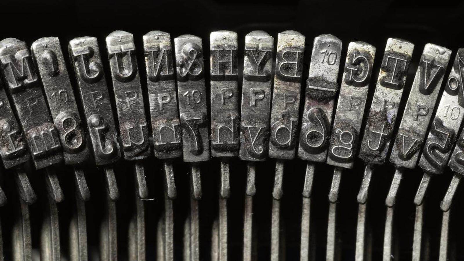
This article is written using the Chronicle Text G1 font; you might not care about this fact, but there are numerous studies confirming that the font used affects how we respond to text. If so many studies have been and continue to be conducted on this subject, it is because the world remains very interested in knowing how to manipulate us without us noticing, how to get us to buy an anti-wrinkle cream or adopt an ideological position thanks to small details that the conscious mind overlooks, but which are morbidly perceived by the unconscious: the smell of stores, the color of signs, the typography of texts.
Politicians also know that a lot is at stake with the choice of font. I could give you the example of Barack Obama, who won the 2008 presidential election using the Gotham font, which, according to experts, embodied the perfect blend of past and future: being a sans-serif font (without the decorative strokes that finish off the ends of the letters) it evoked future and modernity, but at the same time, it also referred to the past of the American industrial heyday. It thus broke with tradition and proposed a new, clear, solid, and orderly future.
Trump also entered the race for typographic manipulation a few months ago when, in December, he announced he wanted to return to Times New Roman and thus reverse the change made by Biden. Traditionally, the American government had communicated in the dreadful Courier New, in which all letters occupy the same width, which makes it unfriendly and barely readable; in 2003 they replaced it with Times New Roman – a classic, conservative, serif font –, until Biden changed it in 2023 to Calibri, a sans-serif font, considered more modern and in a certain sense more inclusive because it facilitates reading by not having unnecessary decorative elements that can confuse dyslexic people and the elderly. One of the reasons the Trump administration argued for returning to Times New Roman is that Calibri is a woke typeface.
You can imagine that I don't have a single bit of Trumpism in me and not many conservative traits, but the truth is that I don't like Calibri, and sans-serif fonts in general, for reading on paper. On screen, perhaps. That is why, unlike print newspapers, exclusively digital portals like Núvol, Catorze or Paper de Vidre do use them. For that very reason, Microsoft adopted it as the default font in the Office suite years ago, although it has now replaced it with Aptos. There are also numerous comparative studies on the readability and benefits of serif and sans-serif fonts, but I must confess that, after looking closely at them, I have reached the conclusion that no conclusion can be reached because the results are often contradictory.
Be that as it may, we writers also have our quirks. And it is even good that we have them. I have taught some writing workshops and participants often send me texts written in horrendous fonts: just by taking a glance at the sheet, without even having read a single word, you can see that everything gives off an amateur air: the font type, the spacing, the justification, the line spacing, the size (which I would say is often directly proportional to the author's self-esteem), and so on. If we want our literary text to be read as such, it should also have the appearance of one. Reading a magnificent text in a poor font is like drinking a good wine from a plastic cup: it is much harder to appreciate its virtues. You only need to open any published book to see that they always, always, always use serif fonts, among which there are plenty to choose from, and plenty to feed all kinds of phobias: there are some that have the bar of the lowercase e tilted, and that confuses me and irritates me terribly. I decided a long time ago that when I write any text—whether it's a novel or an article like this one—I write it in Georgia, size 13 and 1.3 line spacing. I am so used to it that I don't even see the font anymore. That is why sometimes, when I revise a text, I change the font and then I start to see things I hadn't seen before, or the text transmits a different sensation to me (with some fonts, everything sounds better, more solid; with others, everything seems simpler), and that helps me refine it.
Perhaps if this article were written in Baskerville, you would find that the ideas it expresses are more worthy of credibility, or if we had the bad taste to publish it in the much (rightly) maligned Comic Sans, my ideas would seem to you like mere banalities. What is certain is that no matter how much Trump writes his delusions in Times New Roman, we will not swallow them.
