This is how the world map has changed
The UN recommends from now on the Equal Earth projection, which represents more realistically the size of the continents than the traditional Mercator
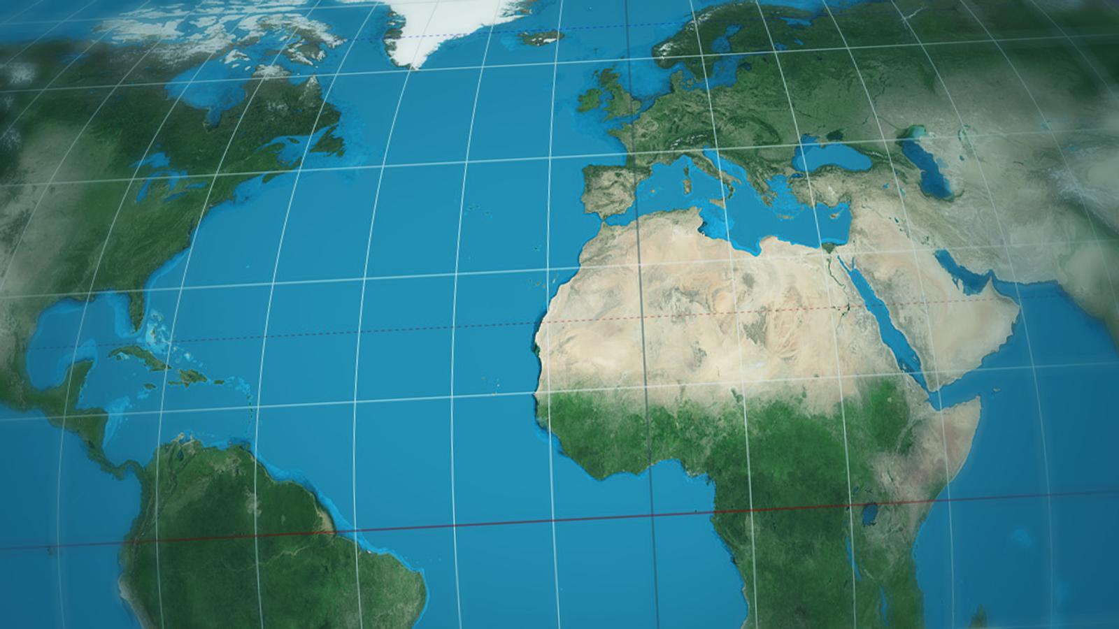
-
CAT -
CAST
“A map is a technical tool, but it also shapes our perception of peoples and continents”. This is how Togo's Minister of Foreign Affairs, Robert Dussey, justified the resolution approved by the UN, which recommends using a different world map from now on.
It involves replacing the Mercator projection, which had become the standard until now, with the so-called Equal Earth, a map created in 2018 (inspired by the Robinson projection of the 70s) that more faithfully represents the dimension or area that territories occupy, even if this comes at the expense of their shape or the scale of distances.

Togo was the driving force behind the Correct The Map campaign, which led the African Union to adopt the Equal Earth map last March and which has resulted in the UN resolution this September. The change of map, argued as a form of “cognitive justice”, was approved at the United Nations General Assembly with 164 votes in favor, 6 abstentions, and only 1 vote against, that of the United States.
Is the Mercator map incorrect?
It is not. But it is true that Greenland and Africa appear there as if they had the same size, when in reality the African continent is 14 times larger than the Arctic island. Why this distortion? It all comes from the difficulty of representing a spherical planet on a flat surface.


The projection made in the year 1569 by the cartographer and geographer Gerardus Mercator was intended to be a useful tool for navigators, and for this reason it prioritizes maintaining the real representativeness of direction lines and distances. To accommodate the curvature of the Earth, this projection makes countries near the equator appear smaller than they are, while those near the poles are elongated.

The fact is that any projection of a sphere onto a flat map will necessarily be inaccurate. In fact, the Equal Earth distorts the outline of some countries and does not maintain the angles that allow for plotting courses with a compass. That is why Google Maps and other navigation systems continue to use the Mercator.
But African countries considered that the standardization of a map that made them look smaller than they are had geopolitical and global perception implications that needed to be resolved. “We needed a more accurate, balanced, and geographically realistic representation of the planet,” said Dussey. And the UN has agreed with them. “By itself, correcting the map –added the Togolese minister– will not correct the inequities of the international system, but it is an important symbol”.
This Sunday, in the Mirades section of the newspaper, you will find the poster of this new world map.
It is a resource that helps to visualize the distortion of each map. These red circles make it clear that the Mercator projection preserves shapes very well, but varies the area significantly at high latitudes, while the Equal Earth projection faithfully preserves the size of countries, but distorts them.


